There are many logos that I like from an aesthetic standpoint, but when it comes to the brand that it represents, I am forced to rethink my choice.
Read MoreThe Top Three of my favorite logos.


The Top Three of my favorite logos.
There are many logos that I like from an aesthetic standpoint, but when it comes to the brand that it represents, I am forced to rethink my choice.
Read MoreFollowing 15 years of collecting, David Meerman Scott's collection, probably the world's most complete, has been digitized and is available for anyone to enjoy. If you feel like taking a trip back in time, Apollo Press Kits will not disappoint.
Read More
Magnitude Software Brand Standards Manual
Identity system updates should not be made just for the sake of making a change. However, over time, as visual brand exploration widens the view, there is no longer an excuse for NOT documenting positive progress.
Read More
Leni Riefenstahl (center) during the filming of Olympia
Occasionally, as visual communicators, we are asked to work on projects for products/services that fail to meet morally sound parameters. Sure, the artistic freedom or compensation may be tough to pass up. However, at the end of the day, it will be the final product that defines your character–not just as a creative professional, but as a responsible citizen of the planet.
Read More
Imagery: C-, Typography: D-, Overall appeal: F
As a visual communicator, I strongly support evolved design standards. Governor Kasich, should you make it all of the way to Pennsylvania Avenue, I would leap at the opportunity to fill the Secretary of Design position within your cabinet.
Read More
slide 28 | creativity + business require a slightly schizophrenic personality. (but in a good way!)
As a creative professional, know that at some point, during your professional career (through either your own desire or necessity) you will have the opportunity to “strike out on your own”. These are some lessons that I have learned during my 30 year career.
On Tuesday, I presented this in webinar form, to friends and colleagues from my alma mater, Rochester Institute of Technology, RIT. Enjoy! –Doug.

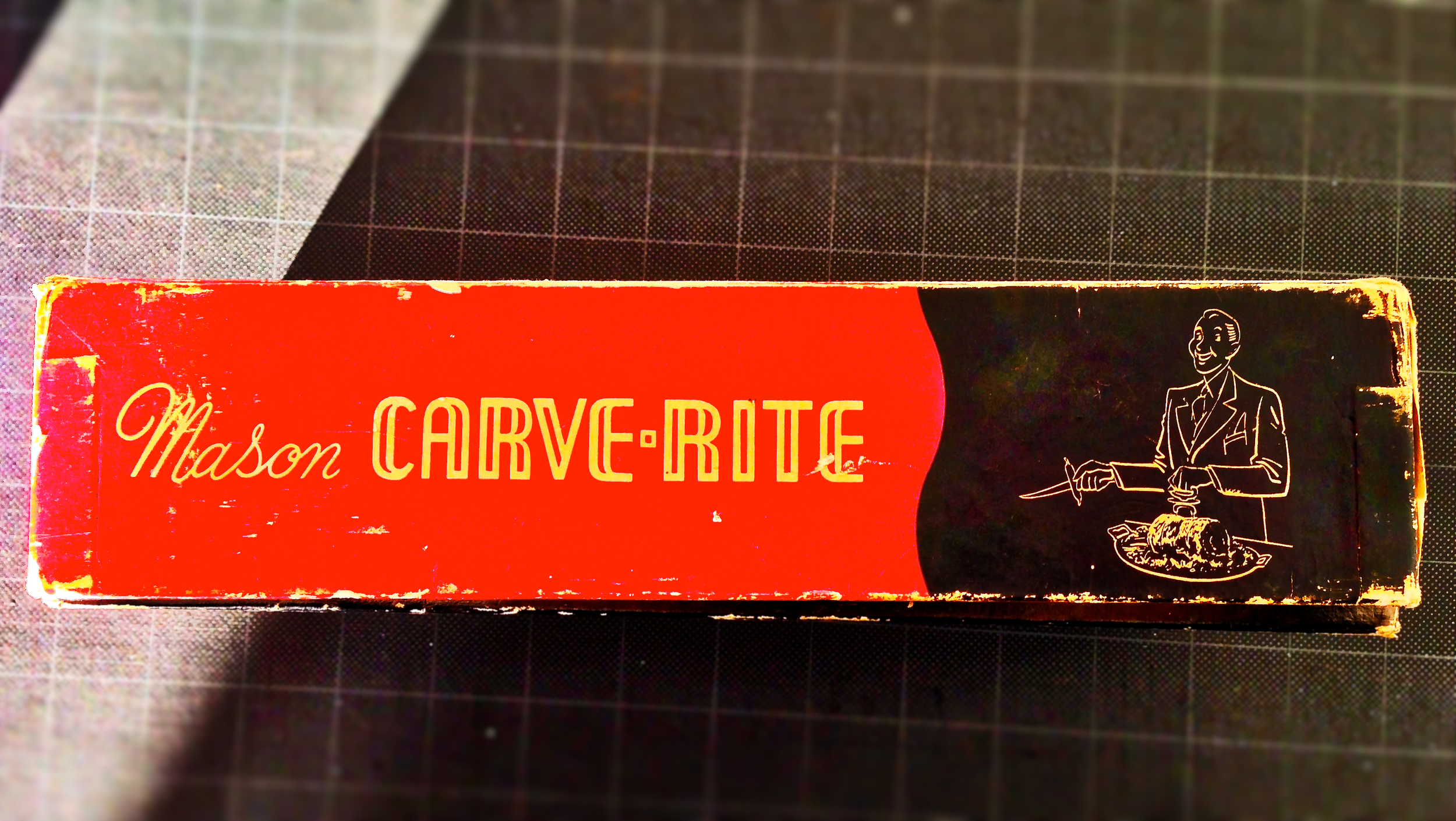
Box Top
Box Side A.

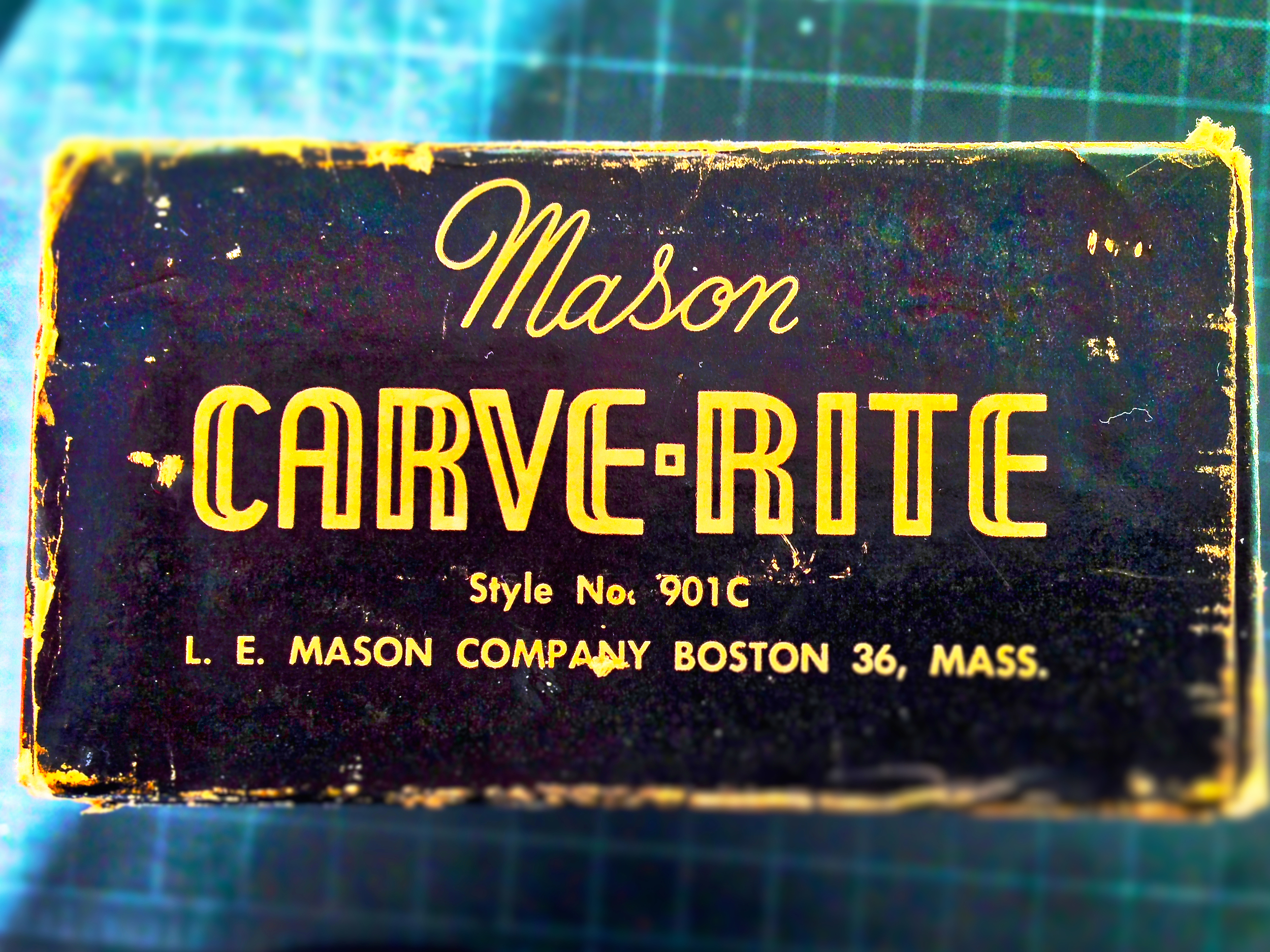
Box Side B.
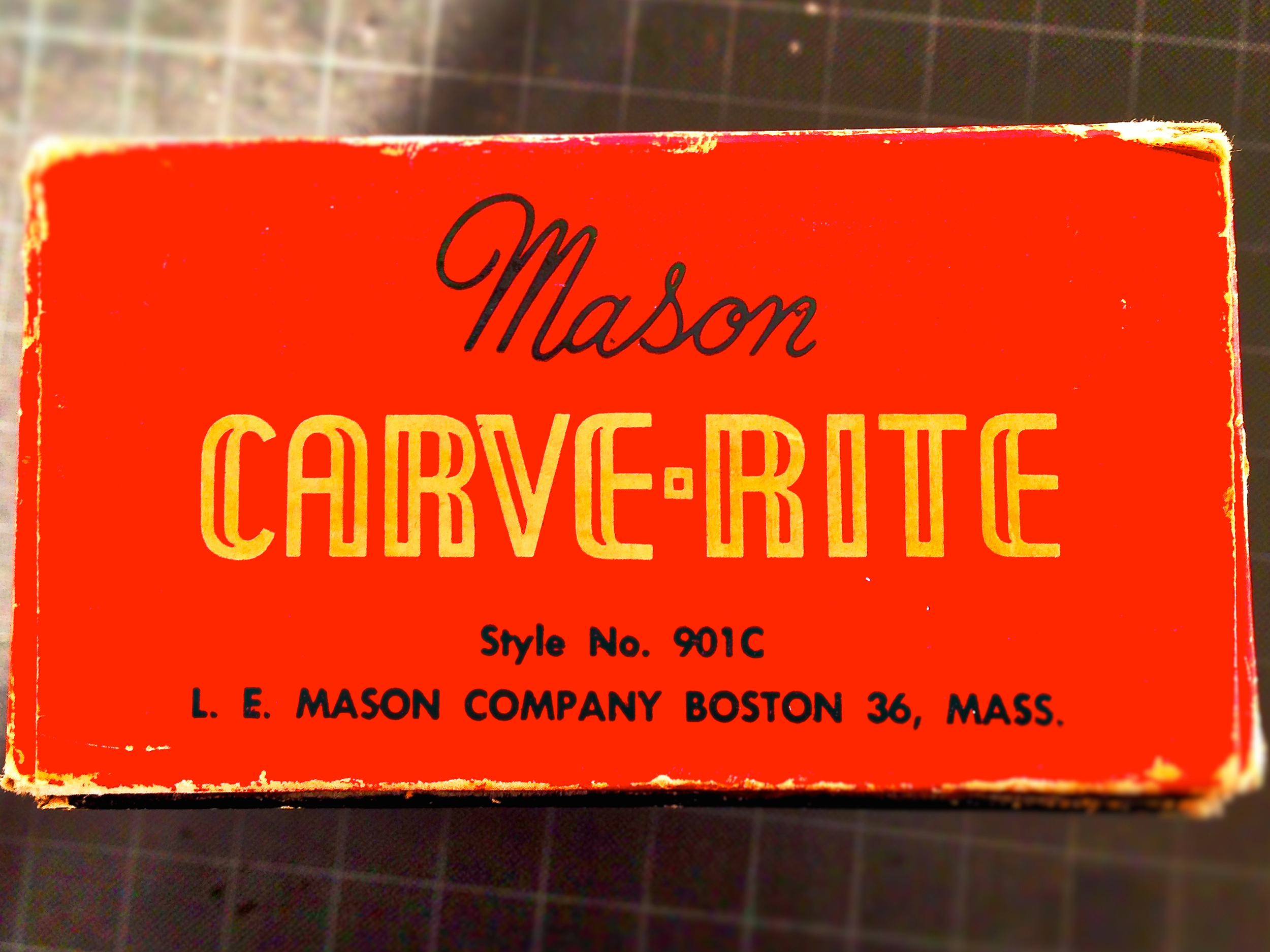
Box Side C.
Box Side D.
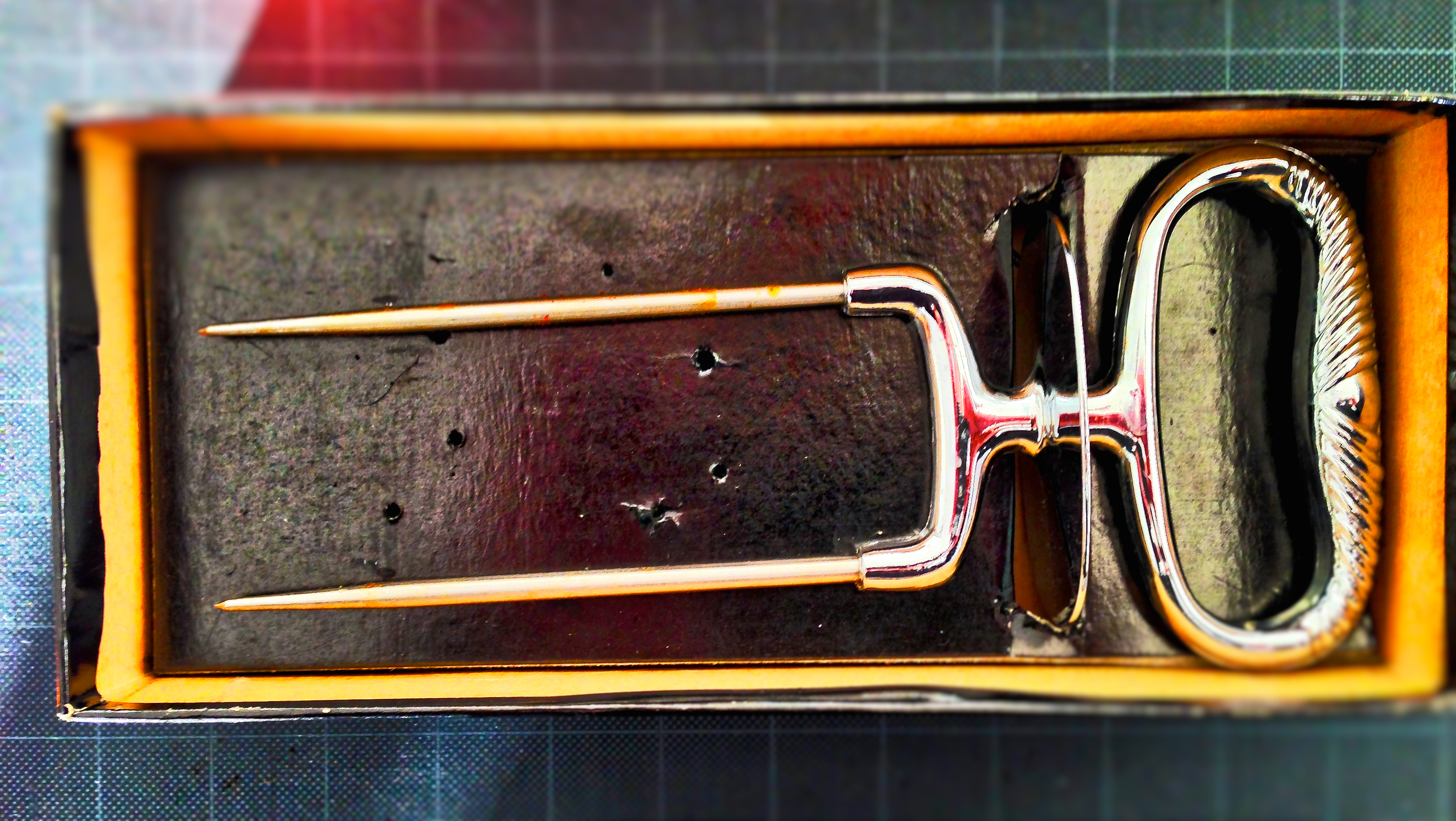
The Mason Carve-Rite Instrument in a package–strong enough for years of storage.
A friend of mine was helping to clean some 'stuff' out of the home of a friend's deceased relative. In a pile of books, tschotskes and knick-knacks–Paul came across this wonderful 'Kitchen App' from a far simpler time.
You have to wonder how many focus groups, market tests, sales chain specialists and internal committees this package had to go through–pre-production.
From a storage perspective, unless you are professional meat carver–the heavyweight cardboard package offers years of product protection. The bright red color also keeps the roast stabilizer from getting lost in the hutch–behind the gravy boats and silver soup ladles. – Doug.

Thirty Years of Mac, Apple Computer website
Amongst my community of graphic design nerds, there is a great deal of discussion regarding the 30th anniversary of the Macintosh computer. As you might expect from the geniuses at Apple Computer, their current website has a world-class presentation–that provides people like me–with a reminiscent stroll down gigabyte lane.
In addition to a video and a timeline illustrating the beige box’s first thirty years, the viewer cannot help but think longingly back to their first Mac experience.

Joe & Ellie Selame of Selame Design Associates, Newton Lower Falls, MA
In 1984, I was fresh out of college and working for Selame Design Associates–in Newton Lower Falls Massachusetts (where the Mac’s birth was unnoticed).
For typography, when we weren't using rubdown type (yes, rubdown type) to create corporate marks for national brands (Amoco, Kodak, Pinkerton, and Goodwill) we were sending out type orders (‘marked-up’ paper manuscripts) to neighborhood typesetting houses.
It was in 1985, that one of the more cutting-edge typesetting firms (Serif & Sans, Newton Massachusetts), introduced as to Quip technology. A Quip machine was the precursor to the (recently outdated) fax machine.

Quip Machine
To “quip,” you would carefully wrap your single-page, letter-size manuscript around a roller (drum). A Quip machine at the typehouse was dialed through a standard telephone line, and once connected, a crudely rendered copy of your original manuscript was received, approximately 20 minutes later. Of course, before any typesetting could be accomplished, the manuscript need to be rekeyed on the other end.

The McCormack & Dodge days.
I got my first peek at a Macintosh in 1986, while a senior designer at McCormack & Dodge, a subsidiary of Dun & Bradstreet Corporation. The new machine resided in the office of creative group leader, Sam Savage. In addition to fulfilling the role of hi-tech eye candy, I am not sure what the machine was actually used for.
I do know that in off-hours, Sam would engage in a word-based fantasy games. There were no graphics, only text.
You would type in commands such as:
“walk forward three steps”
The computer would confirm the action and document its move.
“walk to the right, six steps”
“draw your sword…
Sounds like fun, right? Well, it was all new. And oh, so exciting!
Following a couple of years at McCormack & Dodge, I left the corporate world (with a surly band of marketing renegades) and joined the newly created high-tech public relations and marketing firm, McGlinchey & Paul Associates, where I became the design director.
When asked what type of computer I preferred, of course I requested a Macintosh (a Mac Plus with 40 MB external hard drive, was the current offering).
Please understand, that since everyone else in the firm was a writer and required little computer horsepower, they were provided with IBM PC ‘clone’ workstations–which cost about half as much as my fancy-pants Macintosh.
It was when I asked for a larger monitor (black & white vertical, one-page), that I first received my prima donna reputation. As cute and friendly as the early Macs were, the screens were only slightly bigger than a scuba mask. You could basically design about a quarter of a page at a time. Talk about scrolling!
Since then, I have many Macintoshes to my name–each one getting significantly better. There were a few times during these first thirty years that Mac’s days appeared to be numbered.
A graphic designer and a PC?
Gulp.
No way!
Fortunately, Uncle Steve returned to the helm and righted the listing ship!
Happy birthday MacIntosh!
Thank you!
I wish you many more.
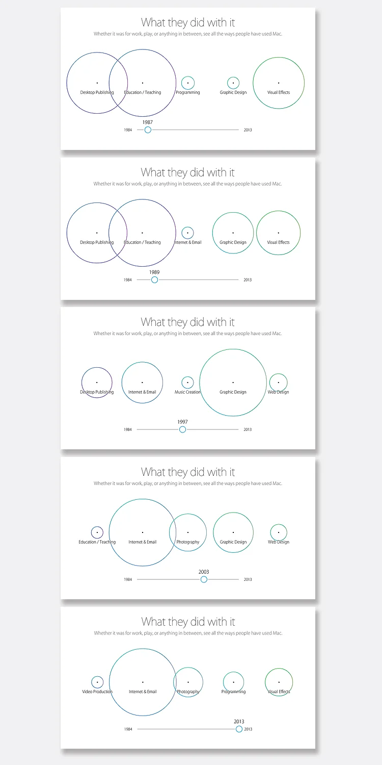
Where have all of the graphic designers gone?
According to Apple’s Macintosh ‘use graphic,’ the graphic design profession appears to be shrinking. Perhaps, others have adopted my newly coined title, Business Communications Architect. – Doug.