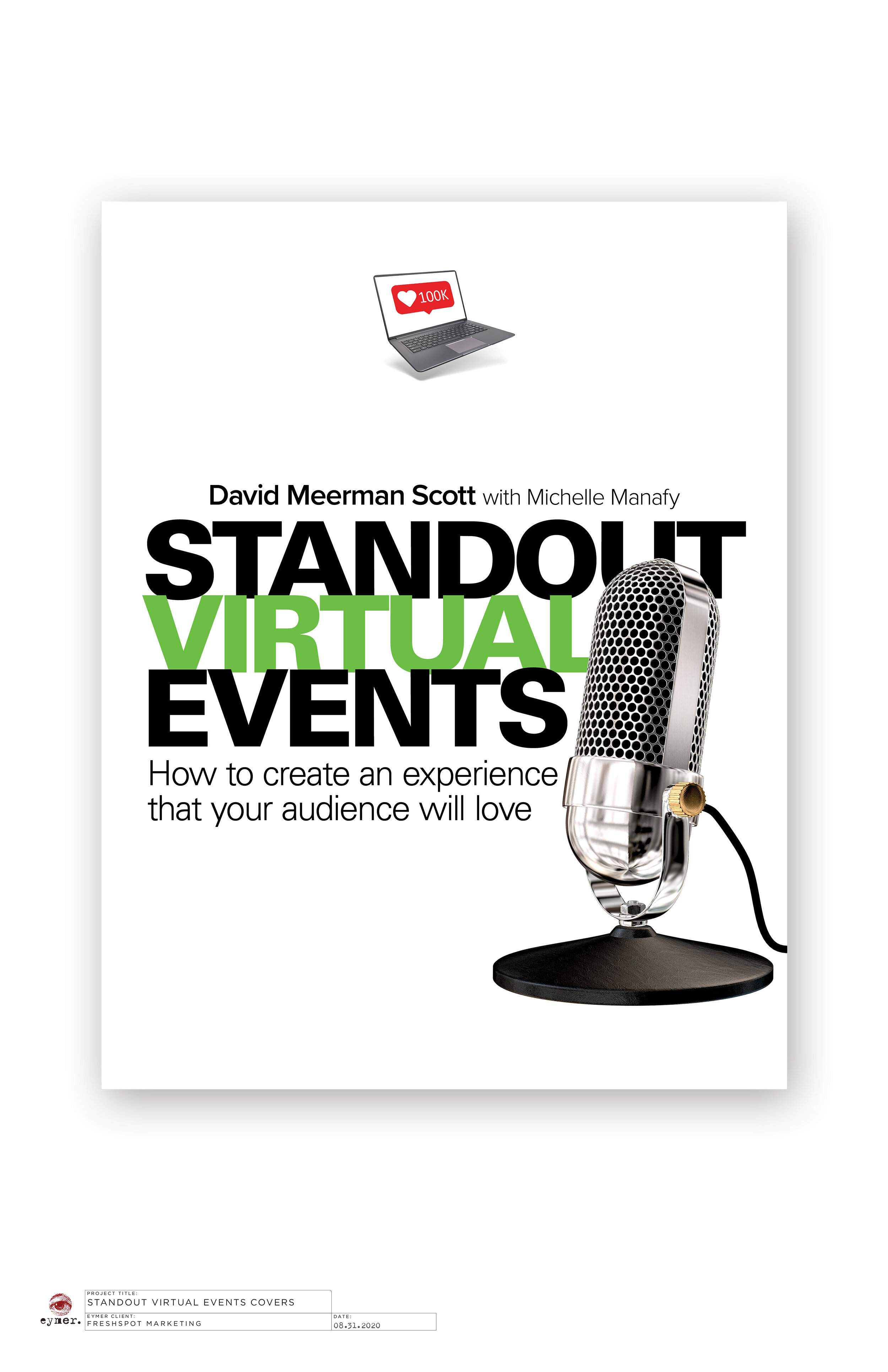
It's true; you can't judge a book by its cover. However, if the book cover stands out on the shelf, you are more than likely to have a customer pick it up.
David Meerman Scott and Michelle Manafy recently teamed up writing and publishing, Standout Virtual Events: How to create an experience that your audience will love.
As you might expect from the title, the work describes strategies for creating and producing online events for the current pandemic world. What makes this book different from the nearly a dozen books that David has authored is that Amazon's Kindle Direct Publishing handled the process's business end.
As David and Michelle's designer, I was asked first to design the book's cover. My cover challenge was two-fold. Graphically, the subject matter of computer-based virtual presentations is needed to describe the main subject. Secondly, the final product was required to stand out on Amazon's virtual bookshelf at a height of approximately one inch and less.
The final product was required to stand out on Amazon's virtual bookshelf.
To meet both of these specifications, I knew from the beginning that the project required a Mies van der Rohe approach in that less would need to be more.
Please keep in mind that because of my twenty-plus years of working with David regarding conceptualizing, we are very seldom on drastically different pages.
Below are my initial concepts that lead up to the final product.
Two of the final cover concept candidates.
The final version of the front cover.
COMING SOON.
I will describe our adventures working with Amazon's Kindle Direct Publishing "meat grinder" and how we won the war in a future post.


