From the "every project has an interesting war story department," EYMER BRAND Laboratories + Think Tank recently completed a visual identity project for Nashoba Brooks School.
A little background:
In 1928, the private academic institution (co-ed from preschool to grade 3 and grades 4 through 8 for girls) was founded by Ms. Brooks in Concord, MA.
Developed as both a fundraising mechanism as well as the means to honor the school's founder, The Gladys Brooks Society encourages those passionate about the school to make a lasting financial commitment.
The Nearly Invisible Ms. Brooks:
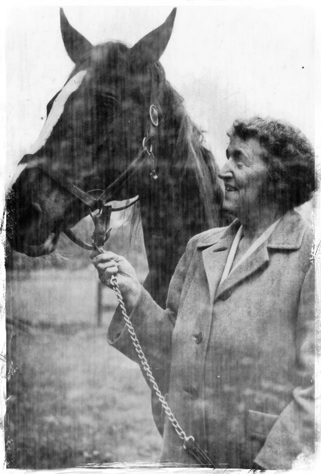
Locating a workable image of Gladys to be used as reference material was the project's initial challenge. After an extensive search, a single photograph was discovered featuring a partial profile of Gladys and an anonymous horse. Despite attempts to sharpen and clean up the image with a handful of computer applications, details were nearly impossible to extract from the dark and murky image.
Early in the process, we decided that a tight scratchboard illustration would be the most effective means to represent our subject matter. The combined team (EYMER and Nashoba Brooks) selected renowned illustrator Kent Barton. We knew that Kent had the portfolio to back our decision but would he be able to decipher the necessary details? We knew that Gladys's hairdo might be a problem since, within our reference image, it appeared as a dense gray "blob."
Additionally, our group elected to have the original schoolhouse added to the background behind Gladys. As a starting point, we had a rough sketch. This hand-drawn puzzle piece was a little easier to work with but still not the detailed clue required for an accurate depiction of the building.
A Sudden GOOGLE Moment:
After combing online through some old Concord newspaper articles, we found the original schoolhouse street address. It just so happens that after plugging this information into the browser window, we hit reference material pay dirt!
It just so happens that 77 Wood Street Concord, MA 01742 is on the market. We found all of the photos required!
The End Result:
Mr. Barton created two illustrations (one of Gladys and a separate version of the schoolhouse). For the full expression of the Gladys Brooks Society visual identity, the two renderings were sandwiched together (as demonstrated at the top of the page).
Problem solved, client happy, and more substantial evidence that we love what we do and the 'war stories' generated! –Doug.


