EYMER BRAND Laboratories + Think Tank, recently completed a corporate identity project for Boston-area interior designers, K+S Design.
Business card, front + back.
The K+S "base mark" is a circle emblazoned with the initials 'K' and 'S' (referring to business partners, Kathleen Thomson and Suzanne Rubenstein).
To visually demonstrate the breadth of their expertise–spanning from classical to modern–the two letterforms are rendered in a formal serif typeface, while the '+' is depicted as a more modern sans serif typeface.
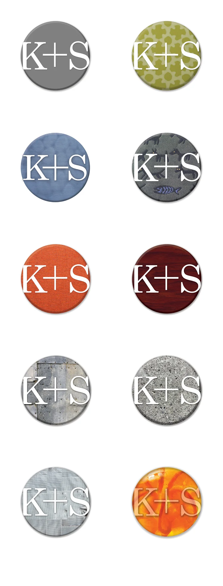
To emphasize the teams abilities to work in a variety of different materials — the base logo that can be easily adapted, through time, to many different treatments.
To better demonstrate this principle, the graphic above shows the gray base logo (left-hand corner).
Beneath, are variations shown in many different materials:
- green patterned wallpaper
- blue fabric
- funky dog and fish fabric (a K+S favorite)
- simple orange fabric
- dark wood
- stressed metal
- concrete
and finally…
- duct tape
- Jell-O mold, complete with imbedded orange slices
Trust us.
Any corporate identity that can stand up to duct tape and Jell-O–will surely stand up to the test of time. — Doug.


